— About this Project —
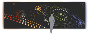
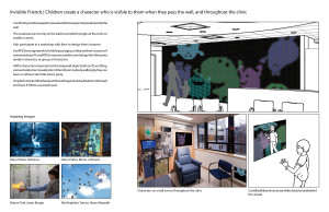
Jimmy’s Junction is an interactive digital installation in a children’s oncology clinic. It was designed to bring positivity, joy and wonder into a challenging environment. The design is a wall with round windows into a world inhabited by playful digital characters who follow, wave and show support to patients and families as they transition from the waiting room into the infusion and exam rooms.
— Background —
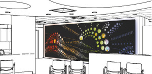 In 2013 I joined the Small Design Firm as a summer intern to help develop a conceptual design for an interactive wall installation in the newly redesigned children’s oncology clinic, the Jimmy Fund Clinic, at the Dana Farber Cancer Institute. (This portfolio page only reflects the conceptual design phase I participated in. My internship ended before the project was implemented.) The overall goal of the feature wall was to create a more beautiful and soothing environment in the Jimmy Fund Clinic. The clinic team asked Small Design Firm to design a piece that would be on the wall along the corridor between the waiting room and infusion and exam areas. It is twenty-three feet long and eight feet high. They hoped the wall could help establish a sense of identity for the new Jimmy Fund space, which will be newly shared by the oncology and hematology departments. The wall can add visual appeal and energy to an otherwise underutilized corridor space. It can be a source of comfort to gaze and get lost into, and help ease the transition from the waiting room to the exam and infusion rooms. By creating an opportunity for patients and families to contribute to the piece, the feature wall can also help establish a sense of ownership and comunity when the new clinic opens its doors. Jimmy Fund families spend significant parts of their lives in the clinic, and this project offers an opportunity to bring a greater sense of wonder and beauty into the space.
The Jimmy Fund Clinic takes care of pediatric cancer and hematology patients, ranging from newborns to young adults, and their families. The families who visit the clinic are diverse in their backgrounds and medical needs. Despite the difficult circumstances of the families they take care of, the clinic feels like a warm, welcoming, fun place, where kids can be kids. There are play activities, music and art throughout the day, creating a warm, supportive atmosphere for everyone who walks through the door. The clinic feels child-friendly without being childish, maintaining a sense of comfort and ownership for adolescents and young children. The wall was designed to meet, and when necessary balance conflicts between, the needs of patients, their siblings, parents and relatives, and clinic staff.
— Design —
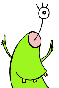
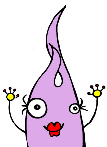
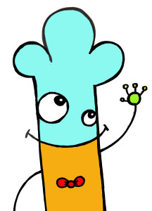
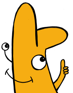
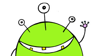
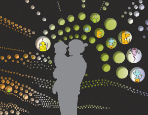
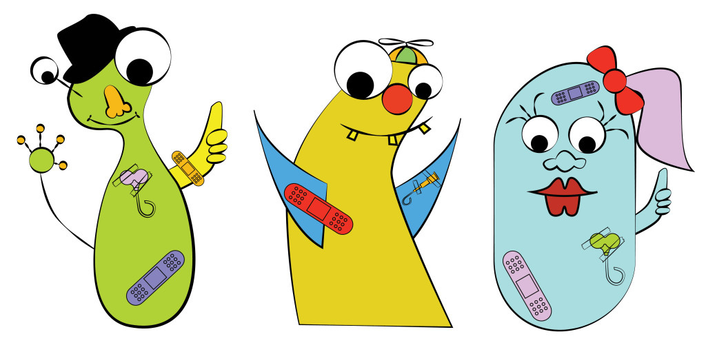
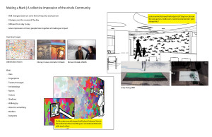
When approaching the feature wall visitors will see a twinkling panel with a landscape or pattern of holes cut away to display glowing lights and screens. The holes reveal characters immersed in a world only partially revealed to the viewer. The characters are designed by local artist Bren Bataclan.
From far away the panel will appear as an abstract canvas for glowing light, color and movement. From close up the characters become visible, rushing forward to wave to, greet and encourage visitors as they pass by. From very close to the wall the soft, excited chatter of the characters becomes faintly audible. The characters are friendly, colorful and slightly abstract. Their purpose is to provide support and encouragement to everyone who passes by.
To make their mark on the wall, patients and family members in the Jimmy Fund clinic can create and sponsor new characters (this is also a fundraising opportunity for the Jimmy Fund). From time to time when they pass by, among the characters who greet them they may catch a glimpse of one who they created.
— Process —
We worked closely with the staff of the Jimmy Fund to establish a series of design requirements for the piece. Through interviews and collaborative brainstorming, we set out a direction for the design of the feature wall. That direction was refined by inviting clinic staff to review different designs and give feedback on the direction so we could narrow down to what was most important to them.
Design Criteria
(Practicalities)
- Keep traffic moving.
- Easy to sterilize.
- Low maintenance.
- Stay enjoyable over weeks and years.
- Opt in.
- Distance and close up viewing.
- Avoid opportunities to contribute inappropriate content.
(Age and Access)
- Appeal to full audience age range (0-25+)
- Accessible for people with low or no vision.
- Usable at multiple heights, including wheelchair height.
- Avoid sensory overstimulation.
- Allow kids in private rooms a way to engage.
- Don’t rely on English fluency or literacy.
(Emotion and Mood)
- Serve as a positive touchpoint in transition from waiting room.
- Feel calming and soothing, and upbeat.
- Normalize patients’ experiences by reflecting what is normal for the patients in the Jimmy Fund in an upbeat way.
- Help viewers be in the moment.
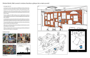
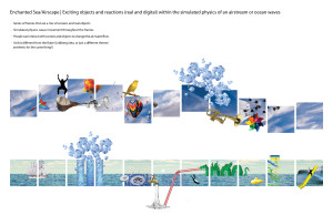
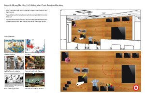
Here are some of the ideas we considered before we arrived at the one we chose (you can click on them to see bigger views):
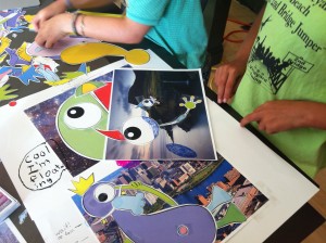
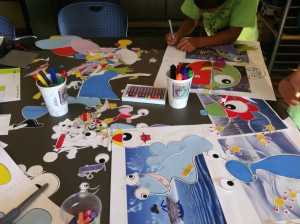
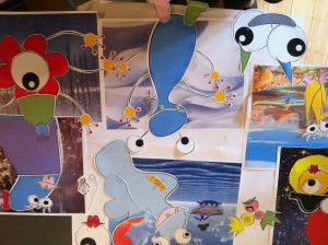
We also conducted a workshop with kids to explore the character design.

