— About this Project —
Cool Classroom is a system for making visible the invisible signals the accompany emotional and behavioral changes. It is designed for learners who struggle to communicate effectively about and/or self-regulate their moods, and their teachers and caregivers. It provides opportunities for communication, self regulation and intervention by visualizing data about students’ emotional arousal.
— Background —
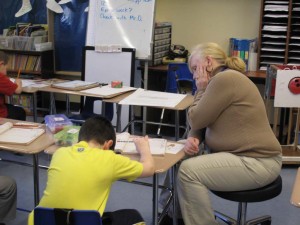 Children with autism are prone to communication difficulties, as well as alexythemia, an inability to express, understand or describe their emotional state. To people who care for and work with these children it can seem like meltdowns, aberrant behaviors or outbursts simply come out of nowhere. For people who don’t communicate and understand their emotions clearly, physiological sensing can help make internal state less mysterious.
Electrodermal activity (EDA) or skin conductivity is a result of changes in autonomic nervous system activation. It can be measured as a proxy for emotional arousal. The Q Sensor, developed by the Affective Computing Group at the MIT Media Lab measures EDA in real time and streams wirelessly to a computer. Using this sensor, researchers can explore the connections between children’s behavior and EDA. By analyzing EDA data from children with autism, in conjunction with behavior and activity information, researchers may be able to identify patterns in EDA that can reveal the underlying state of children who are alexythemic.
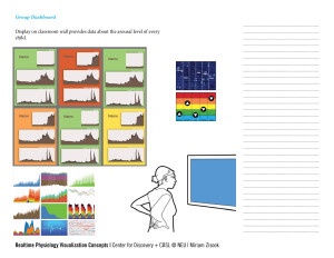
For researchers, EDA is displayed in time series plots, which are too abstract for younger children, caregivers, and family members who need the data the most. Making the data accessible for children with autism and their caregivers requires experimenting with visual, tactile and auditory cues to discover what types metaphors and sensory experiences make the strongest connections with emotion.
In real time EDA data has the potential to serve as a means of communication for a non-or minimally-verbal child. EDA is an invisible signal, one of the many subtle signs of a body in distress or a high level of activation. Making this invisible signal visible gives children an opportunity to externalize a sensation that is currently only experienced internally, and gives caregivers an opportunity react, learn patterns and respond to an enhanced set of cues. While there is much more work to do before EDA data can be used reliably as an “early warning” system for specific behavior, well designed visualizations of EDA can serve as an expressive form of communication for children, and enhance the perceptual abilities of their caregivers.
— Design —
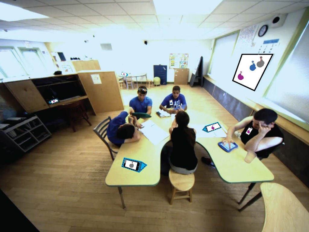
Data from individuals is useful for understanding that person’s unique state. Additionally, people are very social, and individuals can have a significant impact on how other people feel. Because this can play a huge role in classroom dynamics, it was important for this system to display data from individuals and support inferences about interpersonal relatedness.
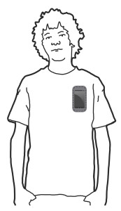
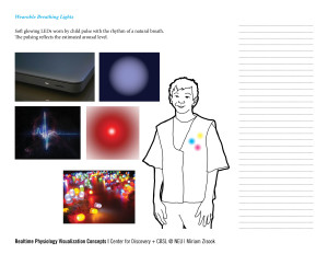
The system has multiple options for displaying individual data using small portable and wearable screens, the visualizations were implemented with front end web tools, including d3, so they can be used across many devices.
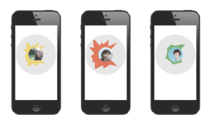
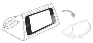
There is a larger display of group data, including the relationship between individuals’ physiology, on a monitor. Each individual has a small unit of display of their own data, the large screens display all the small units and how they relate to each other for considering group dynamics. The wearable screen is portable to allow visualization anywhere, but the sacrifice there is privacy and control. The desktop object is triangular, so it is very easy for the child to turn it over to cover their data if they do not want to share it. It also allows the child ot see their own data which is harder to do while it is work on their clothing.
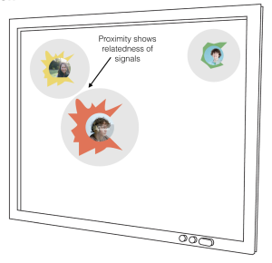
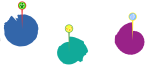
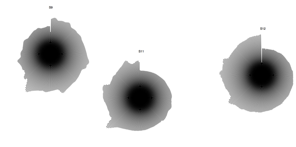
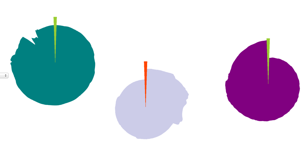
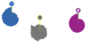
Each unit of data is displayed in a circular graph, where the angle around the circle represents the passage of time (like the progress of the hands on a clock face). The radius of the circle at each time point indicates the level of variability in the child’s data at that time. The color and the image in the circle can be customized to represent each child, while maintaining a level of confidentiality. The small wedge changes color to indicate how the child’s EDA is changing relative to a longer running baseline. The individual units move about on the larger display, with their proximity to each other increasing as the signals become more related. What you will see is that in time periods when 2 individuals are triggering each other and otherwise in sync, the units representing them draw closer.
— Process —
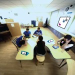
As preparation for the design of this system, I conducted several months of ethnographic research in the classroom setting. After a period of intensive observation I created a series of design criteria for the system, and conducted member checking, a series of interviews where the subjects of ethnographic research have an opportunity to evaluate the findings. The final design criteria, after being adjusted to reflect the end user feedback are:
- Design should be hands free & not assume 1:1 pairs
- Design should work by shifting and drawing staff members’ attention, not necessarily delivering conclusions and new information.
- Design should have a positive focus
- Design should focus on relationship building and empathy
- Design should be child-centered, focused on building the skills to initiate and self-regulate independently
To explore these criteria further, the end users were presented with a series of designs and invited to evaluate them and give feedback about their preferences. A direction was selected and refined based on this feedback.
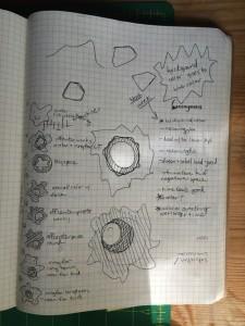
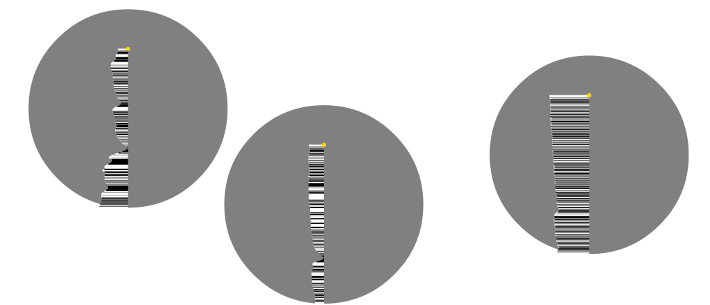
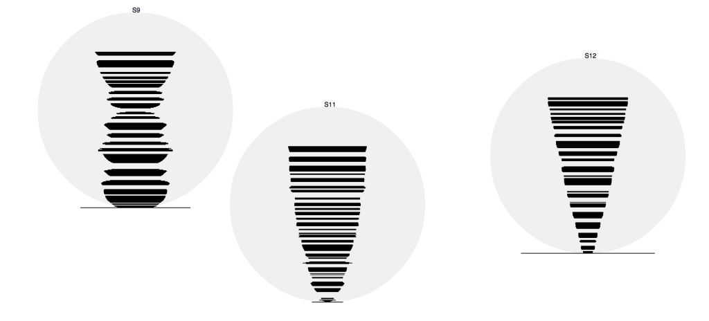
After selecting the direction in terms of form and medium, the visual language of the visualizations themselves were still important to refine. The following images are a snapshot of my design process, you can read a lot more here.
